반응형 웹
연습
<!DOCTYPE html>
<html>
<head>
<meta charset="utf-8">
<meta name="viewport" content="width=device-width, initial-scale=1">
<title>CSS2/ex3.html</title>
<style>
* {
margin:0;padding:0;
}
body {background: #fff;}
a {text-decoration: none;}
nav a:link, a:visited {color: #fff;}
nav a:active {color: yellow;}
h1 {font-size: 1.8em;}
h2 {font-size: 1.3em;}
p {font-size: 1.3em; line-height: 2.5;}
li {font-size: 1em; line-height: 2;}
/* 모바일 - 767px 이하 */
#container {width: 100%; margin: 0 auto;}
header {width: 100%; height: 300px; background: url(img/header.jpg) center no-repeat; background-size: cover; margin: 0;}
nav {height: 50px; background: #000;}
#main-nav {list-style: none; margin: 0; padding: 10px;}
#main-nav li {display: inline-block; color: #fff; font-family: "맑은 고딕", 돋움; font-size: 0.8em; margin: 5px 15px;}
section {position: relative; width: 100%; padding: 15px 5% 10px 5%;}
#container section:nth-child(odd) {background: #eee;}
.page-title {position: absolute; top: 20px; left: 0; padding: 30px 50px;}
.page-title h1 {margin-bottom: 30px;}
.content {margin: 80px auto 10px; box-sizing: border-box; width: 90%; padding: 20px;}
.content ol {margin-top: 20px;}
.sub-titles {color: #0094ff; font-weight: 600;}
.photo {display: none;}
footer {position: relative; width: 100%; height: 100px; background: #000;}
footer p {font-size: 1.5em; line-height: 100px; color: white; text-align: center;}
/* 태블릿 - 768px 이상 */
/* PC - 992px 이상*/
</style>
</head>
<body>
<div id="container">
<header>
<nav>
<ul id="main-nav">
<li><a href="#intro">카페 소개</a></li>
<li><a href="#map">오시는 길</a></li>
<li><a href="#choice">이 달의 추천</a></li>
</ul>
</nav>
</header>
<section id="intro">
<div class="page-title">
<h1>카페 소개</h1>
</div>
<div class="content">
<div class="photo">
<img src="img/tea.jpg" alt="">
</div>
<div class="text">
<p> 영업 시간 : 오전 9시 ~ 밤 10시 </p>
<p> 휴무 : 매주 수요일 (<i><small>수요일이 공휴일일 경우 수요일 영업, 다음날 휴무</small></i>)</p>
</div>
</div>
</section>
<section id="map">
<div class="page-title">
<h1>오시는 길</h1>
</div>
<div class="content">
<div class="photo">
<img src="img/map.jpg" alt="사계 포구에서 서쪽 방향으로 000미터 진행">
</div>
<div class="text">
<p>서귀포시 안덕면 사계리 oooo-ooo</p>
<p>제주 올레 10코스 산방산 근처</p>
</div>
</div>
</section>
<section id="choice">
<div class="page-title">
<h1>이 달의 추천 </h1>
</div>
<div class="content">
<div class="photo">
<img src="img/ice.jpg" alt="아이스 커피" style="border:1px solid white; border-radius:50%">
</div>
<div class="text">
<h2>핸드드립 아이스커피</h2>
<ol>
<li>1인분 기준으로 서버에 각얼음 5조각(한조각의 20cc) 넣고 추출을 시작한다.</li>
<li>평상시 보다 원두의 양은 2배 정도 (20g)와 추출액은 얼음 포함해서 200cc까지 내린다.</li>
<li>아이스 잔에 얼음 6~7개 섞어서 시원하게 마신다</li>
</ol>
</div>
</div>
</section>
<footer>
<p>My times with Coffee</p>
</footer>
</div>
</body>
</html>
/* 태블릿 - 최소크기 768px 이상 */
@media screen and (min-width:760px){
header {height: 400px;}
#intro, #map {box-sizing: border-box; width: 50%; height: 400px; float: left; margin: 0px; border: 1px solid #ccc;}
#choce {clear: left;}
}
/* PC - 992px 이상*/
@media screen and (min-width: 992px){
#container {width: 995px; margin: 0px auto; border: 1px solid #ccc;}
header {height: 500px;}
#intro, #map, #choice {box-sizing: border-box; clear: both; position: relative; width: 100%; height: 420px; padding: 15px 2% 10px 5%;}
.content {padding: 80px auto 10px; width: 90%; margin: 20px;}
.photo {width: 42%; display: block;}
.photo > img {width: 100%; max-width: 320px; height: auto; margin-bottom: 30px;}
.text {width: 42%;}
#intro .photo, #map .photo {float: left; margin-right: 5%;}
#intro .text, #map .text {float: left;}
#choice .photh {float: right; margin-right: 5%;}
#choice .text {float: right;}
footer{clear: both;}
그리드 레이아웃
웹 사이트를 여러 개의 컬럼으로 나눈 후 메뉴나 본문, 이미지 등의 웹 요소를 화면에 맞게 배치하는 것.
화면을 규칙적으로 배열하여 일관성을 유지. 안정된 디자인, 업데이트 편한 디자인,요소를 자유롭게 배치할 수 있음.
(반응형 웹 : 화면 너비에 따라서 웹 문서 요소를 재배치)
그리드 레이아웃을 만드는 2가지 방법
플렉서블 박스 레이아웃, CSS 그리드 레이아웃
두 가지가 있음.
플렉서블 박스 레이아웃(flexible box layout)
그리드 레이아웃을 기본으로 하고 각 박스를 원하는 위치에 따라 배치하는 것
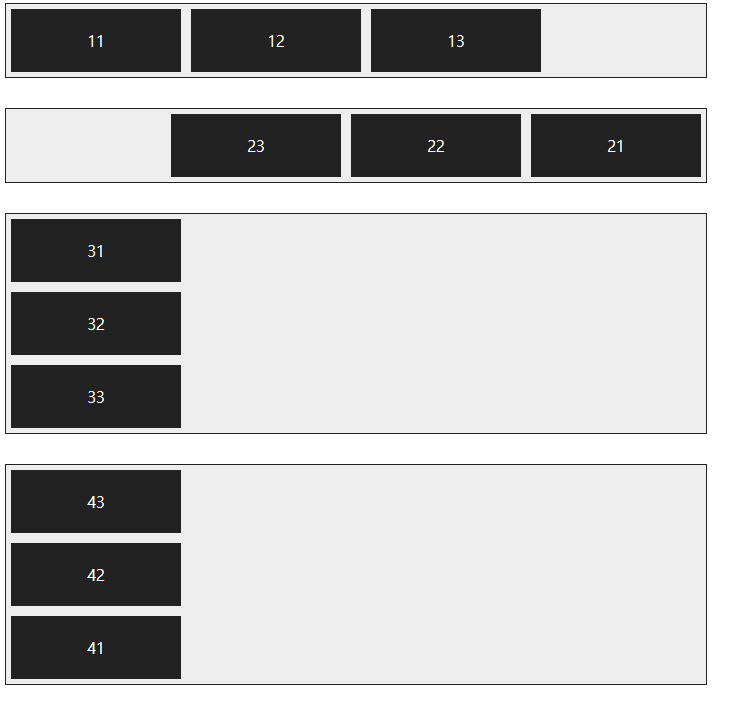
*flex-direction 속성
flex-direction : row; 주축을 가로로 지정하고 왼쪽에서 오른쪽으로 배치(기본값)
flex-direction : row-reverse; 주축을 가로로 지정하고 반대로 오른쪽에서 왼쪽으로 배치
flex-direction : column; 주축을 세로로 지정하고 위쪽에서 아래쪽으로 배치
flex-direction : column-reverse; 주축을 세로로 지정하고 아래쪽에서 위쪽으로 배치
<style>
.container {
width: 700px; background-color: #eee; border: 1px solid #222; margin-bottom: 30px; display: flex;
}
/*플렉스 컨테이너 지정(플렉스 영역 지정) display: flex 컨테이너 안에 플렉스 항목으로 블록 레벨 요소 배치*/
.box{
padding: 5px 45px; margin: 5px; width: 80px; background-color: #222;
}
#opt1 {
/*플렉스 방향 지정 flex-direction 속성*/ flex-direction: row;
}
#opt2 {
flex-direction: row-reverse;
}
#opt3 {
flex-direction: column;
}
#opt4 {
flex-direction: column-reverse;
}
p {
color: #fff; text-align: center;
}
</style>
</head>
<body>
<div class="container" id="opt1">
<div class="box"><p>11</p></div>
<div class="box"><p>12</p></div>
<div class="box"><p>13</p></div>
</div>
<div class="container" id="opt21">
<div class="box"><p>21</p></div>
<div class="box"><p>22</p></div>
<div class="box"><p>23</p></div>
</div>
<div class="container" id="opt3">
<div class="box"><p>31</p></div>
<div class="box"><p>32</p></div>
<div class="box"><p>33</p></div>
</div>
<div class="container" id="opt4">
<div class="box"><p>41</p></div>
<div class="box"><p>42</p></div>
<div class="box"><p>43</p></div>
</div>
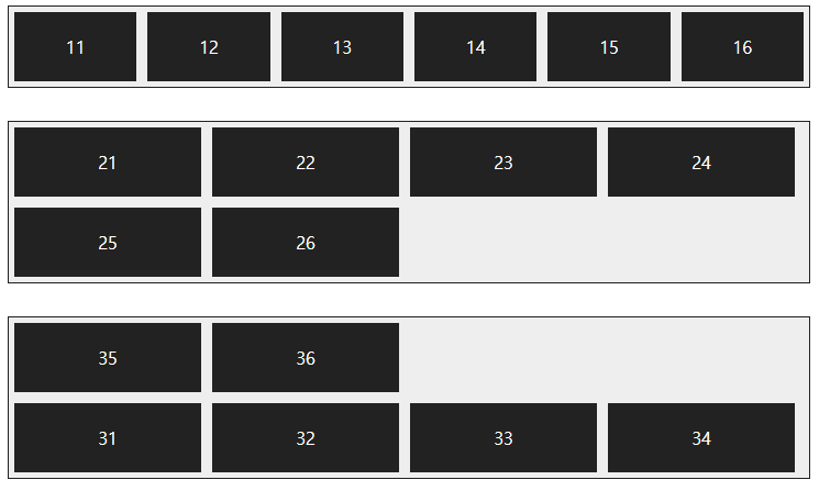
*flex-wrap 속성
flex-wrap : nowrap; 플렉스 항목을 한 줄에 표시(기본값)
flex-wrap : wrap; 플렉스 항목을 여러 줄에 표시
flex-wrap : wrap-reverse; 플렉스 항목을 여러 줄에 표시하되, 시작점과 끝점이 바
<style>
.container {
background-color: #eee; border: 1px solid #222; margin-bottom: 30px; display: flex;
}
.box{
padding: 5px 45px; margin: 5px; width: 80px; background-color: #222;
}
#opt1 {
flex-wrap: nowrap;
}
#opt2 {
flex-wrap: wrap;
}
#opt3 {
flex-wrap: wrap-reverse;
}
p {
color: #fff; text-align: center;
}
</style>
</head>
<body>
<div class="container" id="opt1">
<div class="box"><p>11</p></div>
<div class="box"><p>12</p></div>
<div class="box"><p>13</p></div>
<div class="box"><p>14</p></div>
<div class="box"><p>15</p></div>
<div class="box"><p>16</p></div>
</div>
<div class="container" id="opt21">
<div class="box"><p>21</p></div>
<div class="box"><p>22</p></div>
<div class="box"><p>23</p></div>
<div class="box"><p>24</p></div>
<div class="box"><p>25</p></div>
<div class="box"><p>26</p></div>
</div>
<div class="container" id="opt3">
<div class="box"><p>31</p></div>
<div class="box"><p>32</p></div>
<div class="box"><p>33</p></div>
<div class="box"><p>34</p></div>
<div class="box"><p>35</p></div>
<div class="box"><p>36</p></div>
</div>
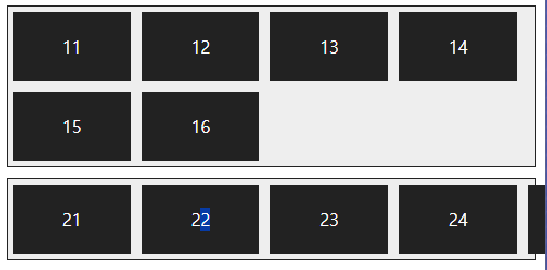
*flex-flow
flex-direction 속성과 flex-wrap 속성을 한꺼번에 지정하여 플렉스 항목의 배치 방향을 결정하거나 줄을 바꾼다. 기본값은 row nowrap
<style>
.container {
background-color: #eee; border: 1px solid #222; margin-bottom: 10px; display: flex;
}
.box{
padding: 5px 45px; margin: 5px; background-color: #222;
}
#opt1 {
flex-flow: row wrap;
}
#opt2 {
flex-flow: row nowrap;
}
p {
color: #fff; text-align: center;
}
</style>
</head>
<body>
<div class="container" id="opt1">
<div class="box"><p>11</p></div>
<div class="box"><p>12</p></div>
<div class="box"><p>13</p></div>
<div class="box"><p>14</p></div>
<div class="box"><p>15</p></div>
<div class="box"><p>16</p></div>
</div>
<div class="container" id="opt21">
<div class="box"><p>21</p></div>
<div class="box"><p>22</p></div>
<div class="box"><p>23</p></div>
<div class="box"><p>24</p></div>
<div class="box"><p>25</p></div>
<div class="box"><p>26</p></div>
</div>
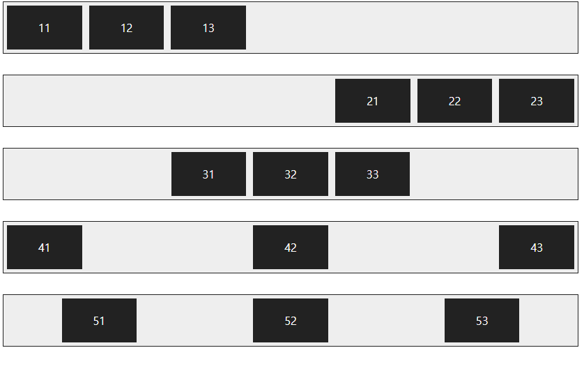
*justify-content
justify-content : flex-start; 주축의 시작점에 맞춰 배치
justify-content : flex-end; 주축의 끝점에 맞춰 배치
justify-content : center; 주축의 중앙에 맞춰 배치
justify-content : space-between; 첫 번째 항목과 끝 항목을 주축의 시작점과 끝점에 배치한 후 나머지 항목은 그 사이에 같은 간격으로 배치
justify-content : space-around; 모든 항목을 주축에 같은 간격으로 배치
<style>
.container {
background-color: #eee; border: 1px solid #222; margin-bottom: 30px; display: flex;
}
.box{
padding: 5px 45px; margin: 5px; background-color: #222;
}
#opt1 {
justify-content: flex-start;
}
#opt2 {
justify-content: flex-end;
}
#opt3 {
justify-content: center;
}
#opt4 {
justify-content: space-between;
}
#opt5 {
justify-content: space-around;
}
p {
color: #fff; text-align: center;
}
</style>
</head>
<body>
<div class="container" id="opt1">
<div class="box"><p>11</p></div>
<div class="box"><p>12</p></div>
<div class="box"><p>13</p></div>
</div>
<div class="container" id="opt2">
<div class="box"><p>21</p></div>
<div class="box"><p>22</p></div>
<div class="box"><p>23</p></div>
</div>
<div class="container" id="opt3">
<div class="box"><p>31</p></div>
<div class="box"><p>32</p></div>
<div class="box"><p>33</p></div>
</div>
<div class="container" id="opt4">
<div class="box"><p>41</p></div>
<div class="box"><p>42</p></div>
<div class="box"><p>43</p></div>
</div>
<div class="container" id="opt5">
<div class="box"><p>51</p></div>
<div class="box"><p>52</p></div>
<div class="box"><p>53</p></div>
</div>
*align-itmes
align-itmes : flex-start; 교차축의 시작점에 맞춰 배치
align-itmes : flex-end; 교차축의 끝점에 맞춰 배치
align-itmes : center; 교차축의 중앙에 배치
align-itmes : baseline; 교차축의 문자 기준선에 맞춰 배치
align-itmes : stretch; 플렉스 항목을 늘려 교차축에 가득 차게 배치
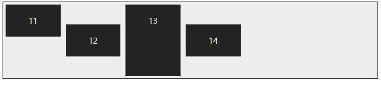
*align-self
교차축을 기준으로 플렉스 항목의 정렬 방법을 결정하지만 그 중에서 특정 항목만 지정하고 싶다면 align-self 속성을 사용.
<style>
.container {
width: 100%; height: 150px; background-color: #eee; border: 1px solid #222; margin-bottom: 30px; display: flex; align-items: center;
}
.box{
padding: 5px 45px; margin: 5px; background-color: #222;
}
#box1 {
align-self: flex-start;
}
#box3 {
align-self: stretch;
}
p {
color: #fff; text-align: center;
}
</style>
</head>
<body>
<div class="container">
<div class="box" id="box1"><p>11</p></div>
<div class="box"><p>12</p></div>
<div class="box" id="box3"><p>13</p></div>
<div class="box"><p>14</p></div>
</div>
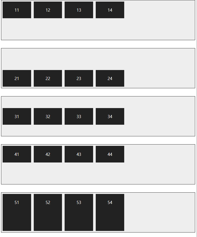
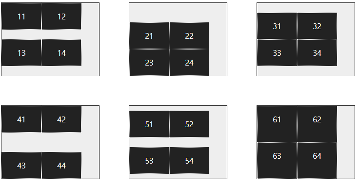
*align-content
align-content : flex-start; 교차축의 시작점에 맞춰 배치
align-content : flex-end; 교차축의 끝점에 맞춰 배치
align-content : center; 교차축의 중앙에 맞춰 배치
align-content : space-between; 첫 번째 항목과 끝 항목을 교차축의 시작점과 끝점에 맞추고 나머지 항목은 그 사이에 같은 간격으로 배치
align-content : around; 모든 항목을 교차축에 같은 간격으로 배치
align-content : stretch; 플렉스 항목을 늘려서 교차축에 가득 차게 배치
<style>
.container {
width: 200px; height: 150px; background-color: #eee; border: 1px solid #222; margin : 30px; float: left;
display: flex; flex-flow: row wrap;
}
.box{
width: 80px; background-color: #222; border: 1px dotted #e9e9e9;
}
#opt1 {
align-items : flex-start;
}
#opt2 {
align-content : flex-end;
}
#opt3 {
align-content : center;
}
#opt4 {
align-content : space-between;
}
#opt5 {
align-content : space-around;
}
#opt6 {
align-content : stretch;
}
p {
color: #fff; text-align: center;
}
</style>
</head>
<body>
<div class="container" id="opt1">
<div class="box"><p>11</p></div>
<div class="box"><p>12</p></div>
<div class="box"><p>13</p></div>
<div class="box"><p>14</p></div>
</div>
<div class="container" id="opt2">
<div class="box"><p>21</p></div>
<div class="box"><p>22</p></div>
<div class="box"><p>23</p></div>
<div class="box"><p>24</p></div>
</div>
<div class="container" id="opt3">
<div class="box"><p>31</p></div>
<div class="box"><p>32</p></div>
<div class="box"><p>33</p></div>
<div class="box"><p>34</p></div>
</div>
<div class="container" id="opt4">
<div class="box"><p>41</p></div>
<div class="box"><p>42</p></div>
<div class="box"><p>43</p></div>
<div class="box"><p>44</p></div>
</div>
<div class="container" id="opt5">
<div class="box"><p>51</p></div>
<div class="box"><p>52</p></div>
<div class="box"><p>53</p></div>
<div class="box"><p>54</p></div>
</div>
<div class="container" id="opt6">
<div class="box"><p>61</p></div>
<div class="box"><p>62</p></div>
<div class="box"><p>63</p></div>
<div class="box"><p>64</p></div>
</div>
'KDT > WEB' 카테고리의 다른 글
| 231127 WEB - JSP2(웹 서버 동작 원리, 주석, %) (0) | 2023.11.27 |
|---|---|
| 231122 WEB - CSS9, JSP1(서버의 역할) (0) | 2023.11.22 |
| 231117 WEB - CSS7 (0) | 2023.11.17 |
| 231116 WEB - CSS6 선택자, 클래스 (0) | 2023.11.17 |
| 231114 WEB - CSS5 위치 (0) | 2023.11.17 |